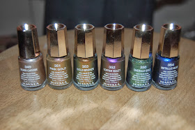
The new Metropolitan collection is the latest addition to the Mavala range. This launched in shops this year, but it was exclusively launched in salons over Christmas. The collection resembles some of the Autumn/ Winter shades from other ranges we have seen this year. Metallics and duotones have clearly been the trend this Christmas, as seen in collections from Jessica and Leighton Denny.
The collection is clever in the sense that each colour has a duotone, meaning in different lights, there is a different colour. This means you can wear two colours on your nails at once. I used to never be a fan of metallics, but the recent metallic craze that has taken over this season, has made me think twice about my opinion.
Pink Gold
I featured 'Pink Gold' in my latest piece of nail art which you can see here. In the bottle, I don't think Pink Gold looks very special. When on the nails though, the two toned shades really come out. I think out of the whole collection, this colour has the most dramatic duotone. In my nail art, I used a pink paint next to it, which I think brings out the pink shade more.
Silver Chrome
'Silver Chrome' reminds me of the silver foil Barry M brought out. Its a really metallic silver and has a really strong colour after just one coat. It looks like melted liquid metal, and will be a fantastic base for some nail art I have coming up.
Metallic Blue
This blue reminds me slightly of my favourite Mavala colour Flashy Violet. Its a much lighter and bluer version though, and will be great in the summer. In normal daylight this is slightly darker and changes between light and dark tones.
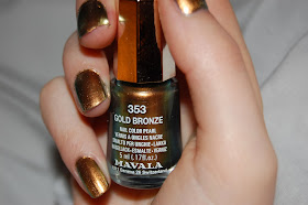
Gold Bronze
'Gold Bronze' is another colour that looks much more exciting when on the nail. This really bronze tone will look great with a tan in the summer. This is another duotone that changes from light to dark and changes more dramatically with light.
Copper Violet
This is probably the most iridescent shade, and needs a few more layers for the best effect possible. The purple shade is a cooler tone, but the copper hues warm it up when it reflects in certain lights.
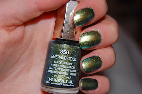
Emerald Gold
This is probably my favourite colour in the collection. Emerald green was THE colour of 2013 and this combined with a metallic duotone is the recipe for success. The Emerald and the Gold really shine out. This is the colour I have kept on the longest from the collection, and it has had a lot of comments from people who have seen it. One comment was that it was very 'mermaidy' which is a comment I like a lot.
These colours have really inspired some ideas for nail art I am planning to do soon so keep watching to see what I come up with.


No comments:
Post a Comment